Visage
the Vistaprint UI Library & Design System
Visage (pronounced "vizz-edge") represents the public face of the Vistaprint brand.
What's New:
Showing deprecated items
Many older components, features, and APIs have been deprecated in 3.0. In a future release, we will be removing these deprecated features, to help keep file size small and to improve performance.
You can identify which elements on your (non-production!) page are deprecated by adding
the show-deprecated.css stylesheet to your local environment.
This stylesheet will make deprecated elements flash, and they will
take on a rusted-out color with a border of rust-colored dots.
Do not use this stylesheet in production!
Changes since v3.0
See the changelist at Gitlab.
Upgrading to v3
There is a detailed document on Confluence with all the v3 changes.
Breaking Changes in v3
-
There's a new set of packages for v3, e.g.
react-visageinstead ofreact-vp-uilibrary - The "evergreen" version on the CDN is no longer getting updates; it will be forever on the latest v2.N release. To update to v3, you'll have to move off of the evergreen URLs.
- There is a new Page Setup API with new static file paths and new typography support.
- The Grid is now proportional by default, and your page's outermost grid(s) needs a new Bounded Content container around it.
-
If you're not using the React components, the static file paths have changed, and you'll need to update them.
(They are all now just
/css/* or /js/*). - If you're not using the React component for Alert Box, the component's dependencies have changed.
New components and new APIs
- Standard Tiles no longer need a Card Set around them. (Card Set is now deprecated.)
- Selection Set is a new component to replace Option Set. It has a simpler API, and it's 59% smaller! (Option Set is now deprecated.)
-
Forms now have a new "standard form"
component
and an Input Group component that provide a standard layout.
- The searchbar input now uses the new Control Icon instead of a textbutton, so it has an updated API. (The old API is deprecated, but will still work for now.)
-
Grid now supports
col-md-classes that set column widths on Medium screens only. - Toggle Switch is a new component to replace Flipswitch. (Flipswitch does not meet accessibility standards, so you should replace any Flipswitches with Toggle Switches immediately.)
- Control Icon is a new component to replace the more complicated Graphic Button. (Graphic Button is now deprecated.)
- Dropdowns have a new look and a simpler API to go with it. (The old API still works, but is now deprecated.)
- Breadcrumbs have a new API with better accessibility support. (The old API still works, but is now deprecated.)
Looking for the React documentation?
The code examples for each component have a link to the React documentation for that component, or you can skip to the React main page.
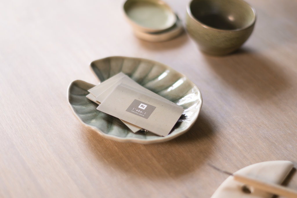
 This Card Container above has the "full bleed" option. With this option, the Container has no internal padding,
so the image runs right up to the edges of the Card Container.
This Card Container above has the "full bleed" option. With this option, the Container has no internal padding,
so the image runs right up to the edges of the Card Container.


